
The changing position continues to be unsettling. The lockdown ("Two") imposed on Nov 5th stopped on Dec 2nd, when we switched to tiers, most of us at tiers 2 and 3. I am expecting that there will therefore be a surge of cases across the month, with a surge of deaths right on Christmas week. The furlough scheme is planned to run until March and I need to look at understanding the situation around printing money (QE, MMT). The Downing St briefing of Nov 26th showed that I'm not the only one thinking that way (three weeks later in publication) and I was impressed how much Chris Whitty pushed the idea that the relaxation over Christmas was so that we kept the mass of population within some rules, however silly – I assume that the thinking here is that the relaxation then encourages the masses to think within the rules rather than simply ignore them wholesale, this keeping people in some sense on board. He also pointed that he personally will be 'on the wards' and I think I heard him say that he wouldn't be hugging any older family because he'd like them still around in April. Even if I was reading between the lines, so to speak, then I like this guy. More of Prof van Tam too, please.
As of mid-Nov we now have three vaccines announced as close to certification. Those making it to market will be in quite fantastic demand – I'm thinking around 20 billion doses wanted, being twice the world population plus wastage, doubling up and repetition. As the vaccines are better understood, so some will be combined for (even) better effect. But it will take all of 2021 and more to move from certification to delivery; we will see unevenness in delivery, inequality between nations and vast sums being made and spent in spreading vaccine to more than the countries which develop them. Whether this will turn into something positive (e.g., exporting the manufacture) or negative (making vast profits) or both, only time will tell. Whether this represents a wholesale change in the way we produce vaccines is also not yet visible.
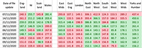
Dec 3rd, data for Nov 27th shows an uptick in incidence as lockdown two comes to an end (Dec 2nd). That really is not good. Turkey is having a torrid time and has shot up in cases per week per million, from safe to vist in the first week on November and the worst in my Europe list from 4th Dec. My table in the November page shows that Wales has a bad situation, case numbers rising as soon as the circuit breaker ceased.
Dec 9th shows an uptick in (case count in) all four nations over yesterday (see right), quite clearly on the south-east quarter of England and Wales has had a torrid time since their circuit breaker ended. This change is even sooner than I had anticipated. At the same time the Brexit negotiations have gone critical, with both sides simultaneously accepting and denying that the last moments are occurring. It could still go either way. Whatever results, we can be sure that the Tories will, initiallly at least, claim this as a success. I still deem the whole affair a disaster and found some fun prose in the Guardian this morning. Reaching the sunlit uplands via shit creek, as one comment had it. Moaning it useless, so we may as well laugh at ourselves.
DJS 20201125 heading to 20201231
[1] Should-covid-19-vaccines-be-mandatory Discussion piece. Please both read and discuss.
[2] https://theconversation.com/covid-vaccines-will-be-here-soon-in-the-meantime-heres-how-to-stay-resilient Resilience.
[3] https://theconversation.com/why-is-covid-19-more-severe-in-the-north-of-england-the-story-in-four-graphs What that says. But it's not actually any better than my own writing. Data comment confined to the over-70s, and otherwise reproducing my line graph from Covid in November.
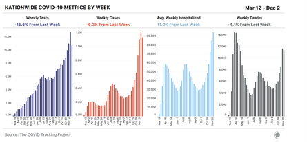
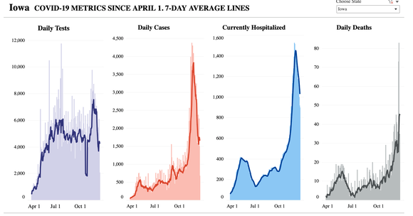
[4] https://www.theatlantic.com/health/archive/2020/12/covid-numbers-hospitalizations A US viewpoint from the start of December. The next line of charts is from there. The supposition is that the US is about to have a further wave, 'worse'. It is very much like my writing, if I were placed there not here. A valid point os that there are reporting issues (already noted here) such that the very irregularity is causing trends —rate of change—to be misleading. Original chart source. These are not well viewed in Safari but Google Chrome works well. https://covidtracking.com/data/charts/us-all-key-metrics
Links to pages updated daily by HMG, being data.gov.uk. It would be so much smarter if I could persuade the HTML to do the updating for me.
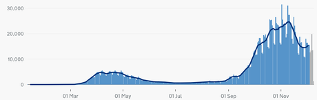
https://coronavirus.data.gov.uk/details/cases Charts like this. whole pandemic shows rate per 100k around 2600, so pushing 3% of the population has had at least one positive test. That chart shows cases by specimen date.
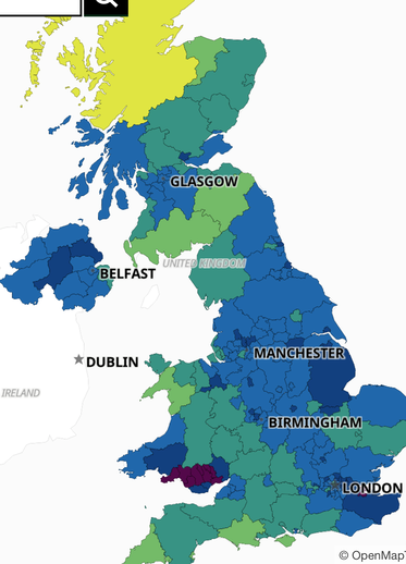
https://coronavirus.data.gov.uk/details/interactive-map Choropleth map (right) as shown usually in blue and green with slider so you can whizz back across the year.
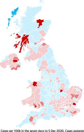
https://www.theguardian.com/world/2020/dec/01/covid-cases-and-deaths-today-coronavirus-uk-map Dual purpose choropleth map (left) kept up to date, I show the 'on the rise' version, which shows the rate of change.
ONS Summary. to Dec 4th:
Multiple sources report that between 4% and 7% of the population has COVID-19 antibodies, which suggests that most of the population is still vulnerable to infection (September to October).
England Infection rate (prevalence, positivity); 1st week September, 1 in 1400, 0.07% 1st week December, 1 in 105, 0.95%
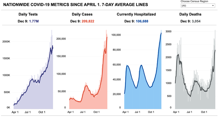
US NATIONWIDE METRIC, average lines
Click the chart to visit the site.
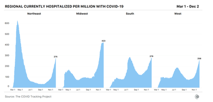
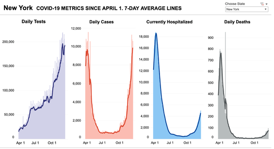
"Iowa is what happens when the Gov't does nothing' I compare Iowa, above, with New York, right, using the data from this link. I've put the US national charts at the foot of this page. I'll update them occasionally, but you could easily use the link to see for yourself. I see Iowa as typical of the Mid-West and NY as typical of the North-East of the USA.
Related Pages: (faulty links updated 20201202)
Essay 291 - Effects of an outbreak what it says, effects, but some description of what we have (and not)
Essay 293 - Covid-19 charts charts published daily reflecting concerns and issues.
Essay 295 Long-term Distancing
Coronavirus (Y10+) modelling problems
Epidemics more general theory
Infectious disease looking at the 2020 problem, particularly effects of the reproduction number changing.
Essay 298 Covid Consequences Surprisingly prescient, considering when it was written.
Essay 304 Covid Disparities A report on the report, including what it doesn't say.
Essay 311 Covid in August International charts updated
Essay 316 Covid in September European comparison charts updated
Viruses are very small Worth reading, I think. (But I would, wouldn't I?)
Essay 318 Covid in October Charts updated through November
Essay 322 Covid in November UK Regional chart and table through Lockdown Two
Essay 325 Covid in December This very page