
 The long-anticipated second wave is upon us. We accepted very readily, to my mind, the suggestion that we're going to be living with this for a long time, and that curbs on whatever it is we think of as normality will apply until Easter '21, where I'm already thinking April/May, as the weather will have to change before activity restrictions are lifted. On the basis of what we have experienced to date, the government will lift too much too soon, such that we have a rise in case counts. It is quite clear that from a political perspective this is a balancing act, weighing public safety and public health against the state of the economy. At the same time one wonders often whether we learned anything at all from what happened earlier in the year.
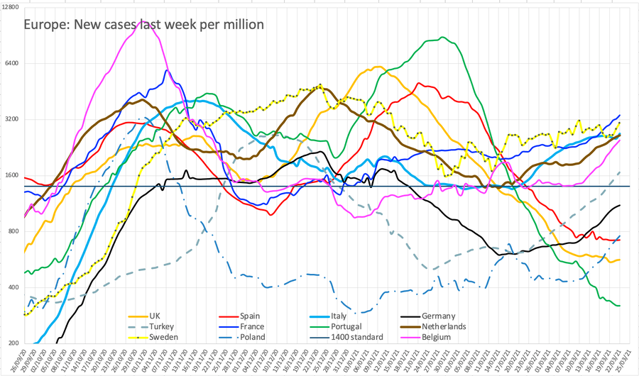
I have been torn what graphs to perpetuate on here and decided in December to have only one updated copy of each chart, where for a while I was updating several editions. I have completed the set of 'local outbreak' maps for September and I think the comparative graph for Europe is useful, but the other national one less so. I will continue to copy the data, updating almost daily. I have adjusted the case count and death count (now only on the September page) so that the multiplier is 200 and the match for the last several weeks is pretty good. Remember that deaths are 35 days behind cases: I am not deliberately saying death is half a percent of recognised cases; they are different populations, not least simply on the age spectrum, where many more young people have tested positive, but the bulk of the deaths are in the retired, heavily weighted to (against might be a better word) the long retired. I've set this graph up with secondary axes so I can modify the offset for deaths if or when appropriate.
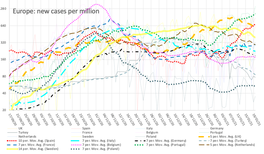
Dec 10th gave a dramatic change in Turkey's figures, basically doubling them. Apparently they have not counted positive tests for asymptomatic people, despite being told to do so. They have complied and the whole data set has changed, shown in the graphs. I've kept the old data, so you can see that —the bottom grey line—on this earlier version of the December graph.
I am intrigued by what it is that we think we know about the virus and how it spreads. There is, judging by the way in which the media refer to the terms, some understanding of R₀, but less of prevalence and less still of the dispersion parameter k. ¹ We sort-of understand 'Hands, Face, Space' but I already wonder how many (of us) have allowed washing to reduce towards their pre-Covid approach, while I am certain that Space is ignored if a mask is worn. It is very clear to me that Space—the two metre gap between people—is the most important of the three, while Face (wearing a mask) is the least of these, done because of the anticipated loss of space. We are told often about the increased likelihood of infection if in a closed space but we are not yet up to speed on the concept of who might be a spreader, or that this is another randomising agent of change.
Figures and graphs
The UK figures in the media had steadied at around 7000 new cases per day and then had a jump to 13,000 followed by 23,000. This has been blamed on 'computer error' and I found adjusted figures on the Worldometer site, going back to mid-September reflected here and retrospectively adjusted to the previously uploaded work. That's not merely inconvenient, it was misleading and probably incompetent.
I do quite a lot of page editing, mostly typos. I don't change or modify expressed opinions, I provide the information that causes me to have made such a change (rare, I feel, though you may feel a modified opinion to be the same as a changed one). I do occasionally adjust the words to more accurately reflect my intended meaning but I'd claim that is not changing the root opinion, only improving the message.
The failure to produce reliable figures throws estimates of R and all the predictions into disarray, so I was pleased to find the correction; UK.gov declared the adjustment to be 25Sep to 02Oct: my figures needed adjustment from 18/9. Spain is retroactively adjusting its figures each week—unreliably—and I needed to adjust figures back to mid-August. This changes the trend graph, sometimes quite remarkably. Sweden continues to work an apparent 3-day week, such that its figures are unreliable for day-to-day adjustments. Like Spain, data infill occurs eventually, but the change wrought by the latest (found) changes the Spanish position quite dramatically. One could wish that other nations would follow suit and engineer the downward movement Spain (Spain's trendline) exhibits, it being the only one up to mid-month to do so.
As of 26th October, France, Spain and Italy have moved to more extreme measures including curfew; judging by my figures, the low countries should have done this and the UK must be on the verge of doing something similar. I don't think half-term is helping as much as it should, which says nothing good about the way the figures are shared, along with their local consequences. I suspect that it is the very unevenness of the figures that is providing confusion. Given the fuzzy nature of the rules, people make their own decisions based on what they believe is the situation. We desperately need testing to catch up, to be widespread and immediate. The tracing side is swamped and sinking; again, the information produced is very poor or poorly shared; the good information is a week in arrears. This means that people are making decisions based on bad information – at best, on old information, where it is the first or second derivative that is what they need to understand. For that to work, the time interval needs to be pretty short and much more immediate.
This graph suppressed from 20210121 onwards.
For example, the UK line here looks to be growing but slowing and just possibly is heading for a peak at the end of October. However, if we continue to believe that the situation on the near continent is relevant and ahead of us, then any peak is not yet in sight. This is much easier to believe, since they have consistently made moves before we do, and since the effect on their numbers has not yet shown, we cannot possibly believe that our behaviour is in any way better, in terms of restricting pandemic spread. In my view on Oct 31, the new tier 4 restrictions to be imposed Nov05 are too late; welcome, but at least three weeks late. Note the sudden rise of cases in Turkey at the end of November. Task: explain this.
In general, and while we continue to berate our UK.gov for its failure to handle the crisis at all well, one must observe that all of Europe has fared badly this year. Remember I used a log scale on the y-axis, so what look like small differences vertically can be surprisingly large. Yet the British figures have always been roughly in the middle of those I record and report. I think the dismay is that it has been clear that the continent of Europe has shown us what is occurring with something like a two-week gain in information, and therefore one might expect the British response to be timely, informed by the advance knowledge. Yet we continue to be remarkably average and typical or extreme when compared with our neighbours So the general feeling 'should do better' applies, of course exaggerated by the permanently negative media.
This new map—current version is here— appeared on 15th Oct and entirely replaces the other version; it is now much easier to see the development of cases and so I have reverted to just the one copy and encourage you to go look and play with the slider just at the top of the map. Be aware that this is usually 4/5 days in arrears, that it shows steps in units of a week, but that any small area (MSOA) to which you zoom shows both a count and a rate – and the slider still works. I found a video of these daily updates, but the new map is much better than that. It is almost as if someone is reading what I write; I express opinion that there ought to be a time-lapse map and lo, there it is, within the same week.
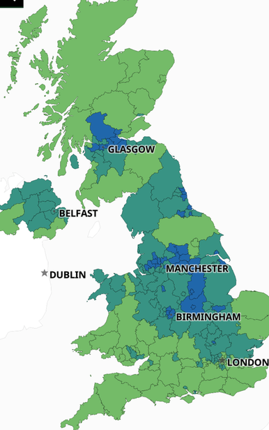
The national case count of around 1100 per 100k [comparisons] hides numbers like 1500 or so in places like Manchester (2461 total) and Liverpool (3105). See the current situation. In terms of rate, or cases in the last week, Liverpool at 590, Nottingham 465, Manchester 380 and Sheffield 365 are peaks against a background national figure of 182. The North-South divide is highly visible. As written on an earlier page, ethnicity and poverty are closely tied with disadvantage, though ethnicity also correlates with public service and therefore often higher viral loads at work (in hospital). Poverty and ethnicity both often imply multigenerational households. Current Regional detail; what is shown in the table to the right is the growth in the last 7 days (a new presentation, not the total historic count as before), as at the 27th. The 27th is the first day any number this month has been smaller than the day before; NI may have peaked at 380 (26th, I think). On the 28th, new cases in the NorthEast briefly flattened off, imitated a day later in the North West. All the other numbers seen on these two tables continued to rise throughout October. So we may perhaps be seeing a tendency for the numbers to flatten off. We have learned that the curve takes a long time to decay, though it rises quickly. So mid-November we may see a change. One repeated question is that, having entered a higher level of restriction, just how long one might stay at that level; the answer seems to be "a long time". I've left these tables to the right as seen on Oct 31, which I think may be the peak for the North East and North West. Subsequent tables and trends are shown in November's page. The map is updated often, well into December. To view changes, access the link and use the slider.
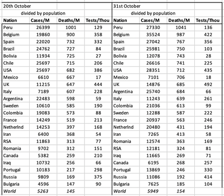
I have inserted the nation comparison table, however flawed. What I see here is issues in Europe and both Americas, but noticeably not Africa or much of Asia. Of course, that could be explained by issues of testing, counting and recording. Sorting on total deaths per million, Europe ranks Belgium, Spain, UK, Italy, Sweden, France; on total cases per million that changes to Spain, Belgium, Luxembourg, Netherlands, France, UK, Sweden. I think my chart above sorts this more helpfully, showing new cases in the last week, per million.
The other issue people want to talk about is compliance; my feeling is that if only 1% was persistently non-compliant, that is quite enough to keep the R rate above unity. On being asked why Blackpool does not have very high rates, the answer was that B'pool has a high proportion of people living alone, though otherwise it would qualify as an expected hotspot. Somehow I don't think the London-centric government will identify with the North needing massive change — not enough to actually do anything life-changing. What we need is to move from multi-generational housing; we need broadband for absolutely everyone and at least internet access for every schoolchild; we need to make isolation not have drastic financial consequences (to encourage compliance); we need immediate and long-lasting retraining—in effect, free education—available for almost all so as to enable those whose jobs have evaporated to return to some sort of employment rapidly and without drastic financial consequences. This is not (quite) Universal Basic Income that I'm expecting to appear, but a form of constructive, positive support that raises the whole and returns it to productive work. we also, not a compliance issue as such, need a testing system that copes with the demand; fast and reliable, so that we can respond in a timely manner, which is a facet of compliance. of course false positives will outnumber false negatives, but if the system worked quickly enough we could isolate until the confirmatory result arrived.
I took this chart, which could be viewed as about compliance, from the lifestyle survey; I see a peak, but schools went back, which changed the activity distribution. What conclusions can we draw? I don't think we can do much more than look to ourselves. I did only the third activity listed, meeting no-one within ten metres. Shopping for takeaway food is the same as going to the shop at home. Generally, the boss does this, so I've done shopping (any form, any setting) less often than once a fortnight since February.
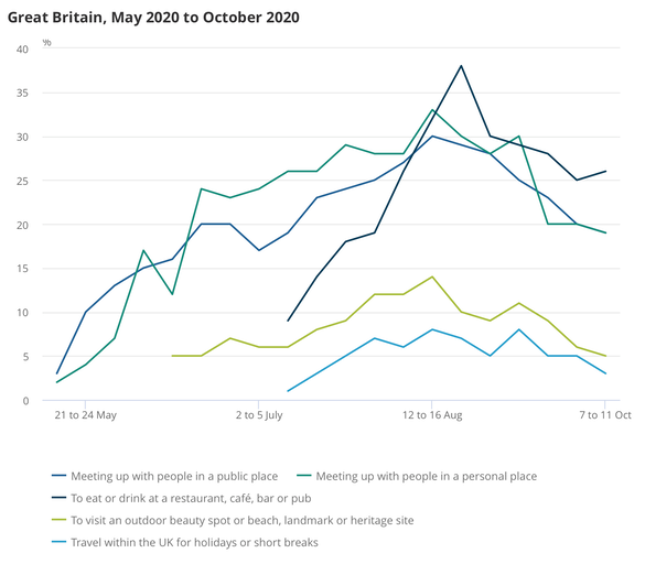
Fig 2 from the same linked document shows about 7% socialised in September with 6 or more (AND lived in a lockdown area), while 25% did no socialisation. A consistent 16-18% sometimes, not very often, or never maintained social distancing.
We have a 'anxiety score', currently at a local peak of 4.3 (out of ten: previous peak early April when it was 4.9). It fell to 4.0 the following week, up to 11/10, but I expect it to rise again following the increased tier 3 application.
Useful links to other ONS reports at the foot. Not here, there.
Also The Conversation [14] says Economic theory tells us that if the system is well designed, it could improve adherence to the lockdowns – which at the moment is extremely low. For it to work, the criteria for each tier needs to be clearly defined, the difference between tiers must be large, and the system needs to be managed by an independent organisation. Why? I agree with the first of these three, could agree with the second, but do not understand the third, except to agree that there might be sense in separating 'rules' from 'government'. They go on: government officials have introduced policies with the expectation that compliance will be limited. [...] [Sage] estimates, for instance, that less than 20% of people self-isolate when asked to, an even lower number than it expected would self-isolate in March.
I'm afraid I don't see the tiers as being particularly different [13]; between tier 1 and tier 2 the difference seems to be something vague about households meeting (indoors in any setting). Tier 1 applies the rule of six indoors and outdoors, already clearly not understood (or not followed or both). Tier 2 (obviously, to my mind) extends to retail, leisure and hospitality; care homes are out of bounds. Let-outs are obviously to do with existing extended support bubbles (like, whatever, excuse there). Tier 3 says no social contact with another household in any setting – which means outdoors too, then. I observe this failing every time I go out, which the daily run.
I find this far too indefinite and, to me, it implies levels 4 and 5 yet to be determined. Boundaries? How about 100 per 100,000 to switch to tier 2 and 400 for tier 3? Or tier 3 happens when tier 2 has run for say 20 days with no improvement?
Go here for the uk.gov's version of the levels of restriction, which ought to be the definition. It isn't clever at all; there should be an easily understood zero state, which means we lost a state called 'low'. We clearly need tiers beyond 3 as I have indicated. This could be so much smarter and set up so as to be effectively permanent, a bit like storm levels. Here's my proffered version, hoping for reaction amounting to support ["Down, test and adjust"]:
0 Unrestricted Dream on; post-vaccine delivery, summer 2021 perhaps, quite possibly 2022.
0.5 Low: no idea. But then apparently neither does uk.gov Leave 'low' within tier 0 for now.
1 Medium: rule of 6, any setting. Definition.
2 High: bubble indoors —confined to your bubble in any indoor setting, rule of 6 outdoors, avoid travel.
3 Very High: Bubble only, any and every setting. Confined to local area. Rule of 6 remains only in open public space. Some businesses closed and a portion (60%) of their costs paid by HM.gov. The December version of tier 3 was quite different and to my mind markedly less restrictive.
4 Lockdown: Many businesses shut and supported; essential travel only. Expect key-workers to do most of the lifting. One of 4-5 has school 'closed' (no-one onsite but the kids of key-workers)
5 Lockdown heavy reserved for a situation where even more is shut down. Very restricted travel, perhaps only with permits and things like curfew. This spare number allows for level 'low' to be defined. I think this higher lockdown level should include a curfew. Possible tightening of what a 'bubble' is; that would be confusing, but 2020 normal.
Edit 2021: it looks as though level 5 is the one with schools closed and curfew is a facet of level 6. But, at the end of 2020 the levels are not followed with any precision except by those who think they will be penalised, like businesses. In general there is what I think of as paid lip service.
6 Shield: Do not go out. Isolate within your home and from others within your household. Deliveries done by people not shielding. Loss of 'bubble'. Therefore, I think, level 6 and above is inapplicable to groups but applies to individuals.
7 in care, in bed not at home, all visitors in 'full PPE'. Possible internet access
8 in hospital, assumed ill, no visitors. Probably no internet access.
9 in ICU, very ill. Effectively unconscious, cut off from all.
10 in extreme ICU akin to being in a biological warfare unit, a danger to others. Only indirect contact. Survival unexpected.
How bad is compliance? That is far from understood. I found several reports based on March and April. One here from May describes non-adherence — that is when a household has covid and so all are isolating, but there were trips for non-essentials; this is a trip out, but not for groceries, toiletries or medicines - things classified as essentials. A more recent (16-9th Oct) IPSOS survey (BBC tv) put adherence at 73%. Of households that were symptom-free (but isolating), 25% were non-adherent (source lost, but try here).
I thought these numbers large enough to warrant looking for more than one primary. Look at this, from a recent SAGE paper [12] (claimed as being minutes) “Around 20% of those reporting symptoms of Covid-19 in England report fully self-isolating by staying at home,” the minutes state. The poorest people are the least likely to self-isolate because they cannot afford to stay home, the scientists say. “Self-reported ability to self-isolate or quarantine is three times lower in those with incomes less than £20,000 or savings less than £100.” The link takes you to the paper proper; I quote paras §9 and 10. Indeed, this may be the paper [12] that prompted The Conversation piece [14]. It is both short and quite readable.
DJS20201022
Updated almost daily through October.
An issue raised in the press on the 27th is that a wide survey of the existence of antibodies shows that there were 6% of people with antibodies but that this has now dropped to 4.4%. The media describe this as a drop of about 25% and imply this is a bad thing, telling us that immunity fades quickly. I am not convinced this is so. If the body has learned to produce suitable antibodies, it doesn't need to carry many in readiness for another attack. Having some strikes me as important; whether that number is sufficient depends on the strength of the next attack (and I'm thinking viral load here). Or perhaps the frequency of attacks, since the report, REACT-2, itself observes that health workers maintain a higher proportion of antibodies, while antibodies in the over 75s declined the most. Comment.
Compliance report 1 83% doing social distancing, 30% doing non-essential activity April 2020
Compliance report 2 late April 2020 about 90% compliance
Compliance report 3 June 2020 75% non-adherent (read the paper), 25% out on non-essential journeys.
Report 4 ONS lifestyle survey October (and series available) Reports that we are not surveying this. Perhaps 34% compliance. Read it yourself.
Brought from essay 313 to here:
Compliance with Covid restrictions
https://www.ons.gov.uk/peoplepopulationandcommunity/healthandsocialcare/healthandwellbeing/bulletins/coronavirusandthesocialimpactsongreatbritain/9october2020 ONS Lifestyle survey.
1. The dispersion variable, k, describes how a disease clusters. So for SARS, k is around 0.16, for MERS around 0.25 and covid is a bit higher still. [2] Or maybe it isn't. So look for quotes such as About 10% of cases lead to 80% of the spread, though I found today '20% of cases lead to 80%'. Think of k as being a measure of the number of people who are infected but not infectious (in the sense that they don't pass it on at all). At k=0.1, some 70% are not passing the disease onwards [3]. At k=1, as few as 40% won't be passing it on.
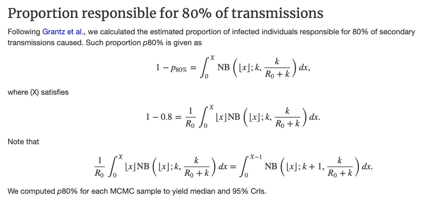
I am having difficulty discovering any precise description of what K or k is. I think k is the proportion of the (currently infected) population responsible for 80% of the spread of infection. I am unclear why a negative binomial distribution is appropriate for modelling any part of the infection process. All too often, this is the small but essential part of modelling that is skated over, usually by reference to a paper already much quoted and without, one suspects, testing the thinking to see if what was argued there is appropriate to the situation under consideration. Which strikes me as bad, if 'proper' academic work. We get away with this sort of thing at school, where we have limited tools (those in the syllabus) and, partly because we have so few, can select the most appropriate representative distribution with relative ease.
I have a suspicion that over-dispersion is what occurs when the variance is bigger than the mean [10]. Certainly that would cause one to switch from a Poisson distribution to a negative binomial, but while the tests for one being better than the other make sense to me, the reason for the choice at all, and to precisely what it might be applied, still escapes.
One description I came across 10 days later said that over-dispersion is the measure of the proportion of people that provide 80% of the spread, currently thought to be 10%, agreeing with what I wrote above. This supports the maths shown below at [11]. Hence we have the ideas of super-spreaders and super-spreading events. What is weird is that the individuals who are spreading are genuinely unaware and often asymptomatic or nearly so – what one might think of as sufficiently close to 'normal' for whatever they do notice to be ignored as trivial and irrelevant. In turn that means that there is little point in playing the blame game for these people, but considerable point in that game applied to those that put themselves in positions to be infected.
I found a decent article about over-dispersion in The Atlantic in mid-November. I copied some quotes from that to the November blog page
[1] https://www.theatlantic.com/health/archive/2020/09/k-overlooked-variable-driving-pandemic/616548/
[3] https://theconversation.com/is-the-k-number-the-new-r-number-what-you-need-to-know-140286
[4] https://www.corona24.news/c/2020/05/21/what-is-the-epidemiological-indicator-of-dispersion-k.html much the same content as [3].
[5] wikipedia on R-number. https://en.wikipedia.org/wiki/Basic_reproduction_number
[6] wikipedia on the modelling https://en.wikipedia.org/wiki/Compartmental_models_in_epidemiology and https://en.wikipedia.org/wiki/Mathematical_modelling_of_infectious_disease
[8] https://cmmid.github.io/topics/covid19/overdispersion-from-outbreaksize.html At last, something with the maths shown.
[9] https://www.casact.org/pubs/forum/07wforum/07w109.pdf handling over-dispersion parameters. I found this quite readable.
[10] negative binomial distribution https://stats.libretexts.org/Courses/Saint_Mary%27s_College_Notre_Dame/MATH_345__-_Probability_(Kuter)/3%3A_Discrete_Random_Variables/3.4%3A_Hypergeometric_Geometric_and_Negative_Binomial_Distributions.
² ³ ⁴ ⁵ ⁶ ⁷ ⁸ ⁹
Related pages:
Essay 291 - Effects of an outbreak what it says, effects, but some description of what we have (and not)
Essay 293 - Covid-19 charts charts published daily reflecting concerns and issues.
Essay 295 Long-term Distancing
Coronavirus (Y10+) modelling problems
Epidemics more general theory
Infectious disease looking at the 2020 problem, particularly effects of the reproduction number changing.
Essay 298 Covid Consequences surprisingly prescient, considering when it was written.
Essay 304 Covid Disparities A report on the report, including what it doesn't say.
Viruses are very small Worth reading, I think. (But I would, wouldn't I?)
Essay 318 Covid in October This very page. Charts updated through November
Essay 328 Vaccine progress What it says on the tin.
Essay 328 Vaccine progress What it says on the tin.
Essay 332 Covid in January Lockdown 3 takes effect
The three levels:-
Medium This is for "local" areas where national restrictions continue to be in place. This means:
- All businesses and venues can continue to operate, in a COVID-19 Secure manner, other than those that remain closed in law, such as nightclubs.
- Certain businesses selling food or drink on their premises are required to close between 10pm and 5am. Businesses and venues selling food for consumption off the premises can continue to do so after 10pm as long as this is through delivery service, click-and-collect or drive-thru.
- Schools, universities and places of worship remain open
- Weddings and funerals can go ahead with restrictions on the number of attendees
- Organised indoor sport and exercise classes can continue to take place, provided the Rule of Six is followed
- People must not meet in groups larger than 6, indoors or outdoors
High Add these:
- People must not meet with anybody outside their household or support bubble in any indoor setting, whether at home or in a public place
- People must not meet in a group of more than 6 outside, including in a garden or other space.
- People should aim to reduce the number of journeys they make where possible. If they need to travel, they should walk or cycle where possible, or to plan ahead and avoid busy times and routes on public transport.
Very High Add these:
- Pubs and bars must close, and can only remain open where they operate as if they were a restaurant – which means serving substantial meals, like a main lunchtime or evening meal. They may only serve alcohol as part of such a meal.
- People must not meet in a group of more than 6 outside, including in a garden or other space.
- Wedding receptions are not allowed
- People must not meet with anybody outside their household or support bubble in any indoor or outdoor setting, whether at home or in a public space. The Rule of Six applies in open public spaces like parks and beaches.
- People should try to avoid travelling outside the ‘Very High’ area they are in, or entering a ‘Very High’ area, other than for things like work, education, accessing youth services, to meet caring responsibilities or if they are in transit.
- People should avoid staying overnight in another part of the UK if they are resident in a ‘Very High’ area, or avoid staying overnight in a ‘Very High’ area if they are resident elsewhere.